Tint, Tone and Undertone: What Colour Words Actually Describe
Tint, tone and undertone describe different parts of a colour. Learn to read shade descriptions clearly and compare beauty products without relying on vague labels.
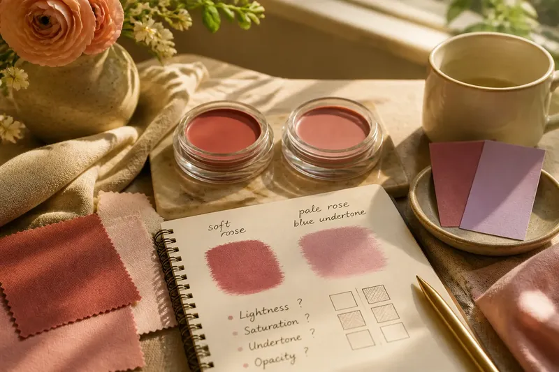
Is a “soft rose” blush pale, muted or cool? Tint, tone and undertone answer different questions about colour, but beauty descriptions often use the words loosely. Separating them helps you compare shades without asking one adjective to do three jobs.
Tint describes a colour lightened with white
In basic colour terminology, a tint is made by lightening a colour with white. Add white to red and the result moves towards pink; add more and it becomes paler. The colour remains related to red, while its lightness changes.
Beauty labels use tint in another common sense. A lip tint usually means a sheer or staining product, not necessarily a pale shade. In a description such as “a light tint of berry”, the word may instead refer to the colour. The surrounding wording matters.
Sheerness and paleness are separate properties. Sheerness describes how much colour a formula deposits; paleness describes the colour’s lightness. A sheer deep red can still look deep, while an opaque pale pink can look light and strongly coloured. The word tint by itself does not tell you which property is meant.
Tone describes how vivid or muted a colour appears
In colour theory, a tone is made by adding grey to a colour. This generally reduces its vividness: a clear red may become dusty or subdued. Tone is useful when a description concerns intensity rather than simply whether a shade is light or dark.
Cosmetics copy uses toned less precisely. “Soft-toned peach” may suggest a muted peach, but it does not specify how subdued the colour is or whether it leans towards pink or orange. Treat the phrase as a clue, not a formula.
Lightness and saturation can vary independently. A colour can be light and vivid, dark and muted, or dark and vivid. “Pale” and “muted” therefore offer different information when they appear together: one concerns lightness, the other vividness.
Undertone describes a colour’s direction
Undertone is a subtle lean towards a neighbouring colour family. A red might lean blue or orange; a beige might lean pink, yellow, peach or olive. The term is especially useful when two shades seem similar until you compare them side by side.
Beauty writing applies undertone to products, complexions and the expected relationship between a product shade and skin. These are related but distinct claims. A “cool undertone” in foundation copy usually describes the shade’s colour direction; advice about someone’s cool undertones refers to their complexion.
Coolness does not mean pale, and warmth does not mean deep. Undertone also says nothing by itself about whether a shade is vivid or muted. Think of two envelopes: each has a main colour, but placing them side by side can reveal a faint cast that was difficult to notice alone.
A hypothetical blush comparison separates the clues
Say you are choosing between two invented cream blushes: one described as “soft rose”, the other as “pale rose with a blue undertone”. You have no reliable swatches, and the product photographs use different lighting. Rather than treating “soft” and “pale” as synonyms, separate the claims:
- Lightness: “Pale” points towards a light colour; “soft” does not settle lightness. If lightness matters, look for a direct light-to-deep description or a comparable swatch; if neither is available, leave it undecided.
- Saturation: “Soft” often suggests muted, but brands use it loosely. If a swatch appears subdued beside a vivid rose, treat mutedness as plausible; if the evidence is only a product name, do not infer it.
- Colour direction: “Blue undertone” gives a cool lean; “soft rose” leaves the direction open. If a neutral-background swatch supports the blue lean, record it; otherwise keep the direction uncertain.
- Formula appearance: Neither description says whether the blush is sheer or opaque. If the formula copy specifies coverage, use that; if it does not, do not infer coverage from the shade name.
- Photograph conditions: Different lighting can shift apparent colour. If both shades are shown under comparable neutral lighting, compare them directly; if not, treat the images as weak evidence and seek another view.
- Remaining uncertainty: The first blush has no stated undertone. If another description or swatch clarifies its direction, compare that with the blue-leaning shade; if not, conclude only that the available wording is insufficient.
The resulting comparison is limited but useful: the second blush is described as pale and blue-leaning, while the first may be muted and has an unspecified direction. Neither description establishes coverage, and the photographs cannot settle the comparison if their lighting differs. The answer is not a forced winner; it is a clear account of what is known and what remains open.
Read shade descriptions by separating their claims
Translate each colour word into a question. Does it describe lightness, vividness, colour direction or how much the formula covers? A familiar label should not be asked to answer all four.
- Lightness: If the description says pale, light, medium or deep, use that as a clue about how light or dark the colour is; if it says only “soft”, leave lightness unresolved.
- Saturation: If it says vivid, clear or bright, expect a stronger impression of colour; if it says muted, dusty or greyed, expect a more subdued impression. If the wording is vague, compare a swatch rather than treating the adjective as exact.
- Colour direction: If it says blue-based, yellow-based, pink-leaning, peachy or olive, use that as a directional clue; if it says only neutral, check whether the brand explains what neutral means.
- Opacity: If the description says sheer, buildable or opaque, use it to understand coverage; if it gives no coverage information, do not infer it from the colour name.
These labels are not fully standardised across brands. “Neutral” may mean balanced between warm and cool, or simply that no strong direction is being claimed. “Warm” may point towards yellow, gold, peach or orange. A named neighbouring hue is often more informative than a broad category.
Colour also depends on comparison. A rose can look cool beside peach and warm beside a blue-red. The shade has not changed; the reference point has. Fabric swatches behave much the same way when placed next to one another.
Which colour word answers which question?
Does tint always mean a pale colour?
No. In colour theory, a tint is a colour lightened with white, but beauty products also use “tint” for a sheer or staining formula. Check whether the word describes the colour or the product type.
Is tone the same as undertone?
No. Tone generally concerns how muted or greyed a colour is, while undertone concerns its direction, such as pink, yellow or blue. A shade can be both muted and blue-leaning.
Can a shade be warm and muted at once?
Yes. Warmth describes colour direction, while mutedness describes vividness. A subdued peach can be warm and muted without contradiction.
Does a cool undertone mean a colour is pale?
No. Coolness does not specify lightness. A blue-leaning red can be deep, just as a warm beige can be pale.
Use precise colour words without expecting perfect labels
A description such as “light, muted rose with a blue lean” is more informative than “soft pink” because it separates three properties. If you are writing shade copy, name the colour family first, then add lightness, saturation and direction only when the evidence supports them.
Tint, tone and undertone make colour descriptions easier to parse, but they cannot remove uncertainty from a photograph, screen or loosely written product name. For a useful tint, tone and undertone comparison, record what each label actually says and leave unsupported claims open. That small distinction can prevent a confident adjective from quietly becoming a conclusion.